Custom Widget Styling with CSS
The widget is highly customizable. You can adjust and adapt the widget looks to fit your designer needs by applying custom CSS styling.
How do I apply custom CSS styling to my widget?
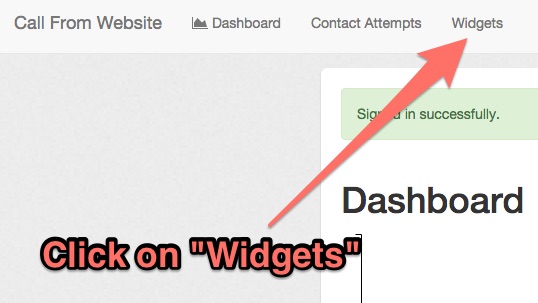
Log in to your admin panel
and click on
"Widgets".

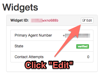
Select and click
edit
for the widget you want to customize.

Place your CSS customizations in the
Custom Styling for the Button
field.

How do I override the current styling?
All buttons get the default styling applied to them. You can download the base style from the link provided on the settings page.
By entering your own CSS into the field, custom properties will override the default properties.
What kind of CSS styles can I apply, and which selectors do I use?
To customize the button, use the
#button
selector.
(What are css selectors?)
There are no limitation on CSS properties. You can apply any kind of styling as long it is supported by the browser. (See CSS References)
Examples
Changing button color
#button { background-color: blue; }

Changing button position
Bottom left:
#button { right: auto; left: 30px; }
Top right:
#button { bottom: auto; top: 30px; }
Top left:
#button { bottom: auto; right: auto; left: 30px; top: 30px; }
Square button
#button { border-radius: 2px; }
